Eye In The Sky

Whenever you board a plane, thousand of decisions had to be made. Within them, there’s few more important than choosing the path to fly. From a passenger perspective, a plane just takes a route from A to B; in reality, the sky is a complex, constantly changing chaos. Behind every safe journey, on-time landing and smooth cruise there’s a synergy of the most powerful computers on Earth and expertise of highly trained professionals. We’re talking about the weather, but this is far from smalltalk; it’s a story of how we made that cooperation better than ever before.
Even though we trust our models to analyze, predict and plan, a human in the loop is still a necessary component for critical operations. Humans are great at making hard decisions, but poor at observing trends in raw data; that’s why the presentation is a truly important component of our every system, and within that, weather imagery is one that’s simultaneously extremely hard to get right and vitally important. The data comes from numerous sources in a multitude of formats. Supercomputers across the world run 24/7 to deliver the most accurate predictions and create a flood of information spanning the entire airspace.

Tiled rasters
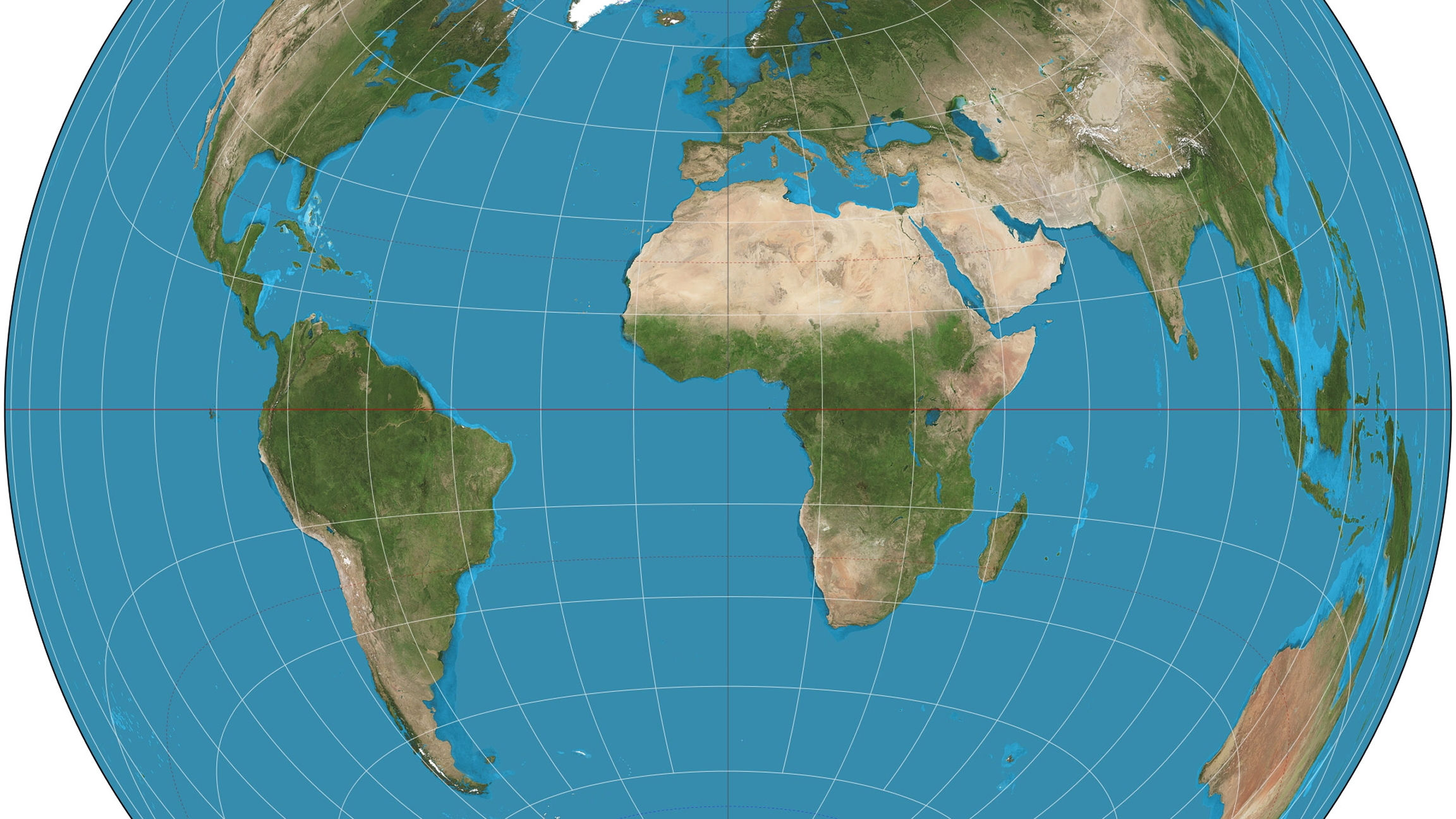
Historically, to make sense of that scenario, the ubiquitous solution was server-side tile imagery. In a nutshell, it divides the entire planet into a recursive grid of squares. At level 0, one square covers the entire planet. At level one, we get 4, and so on. Tiles are uniquely identified by a triple of coordinates x/y/z, one denoting the level and the other denoting the normalised position in the grid. Each of the tiles is typically of the same size regardless of the level, they use the desired map projection (almost always Web Mercator) and are served as RGBA images that can be directly overlaid on the map and presented to the user:
This solution has many benefits; it brings all of the data sources into one common standard; it allows dynamic, on demand downloads of images for the requested area and produces images that always look sharp, because the increased zoom levels use more pixels for the given global area. It also makes rendering quite simple and as such is supported as a built-in method in most map packages such as Mapbox and Maplibre.
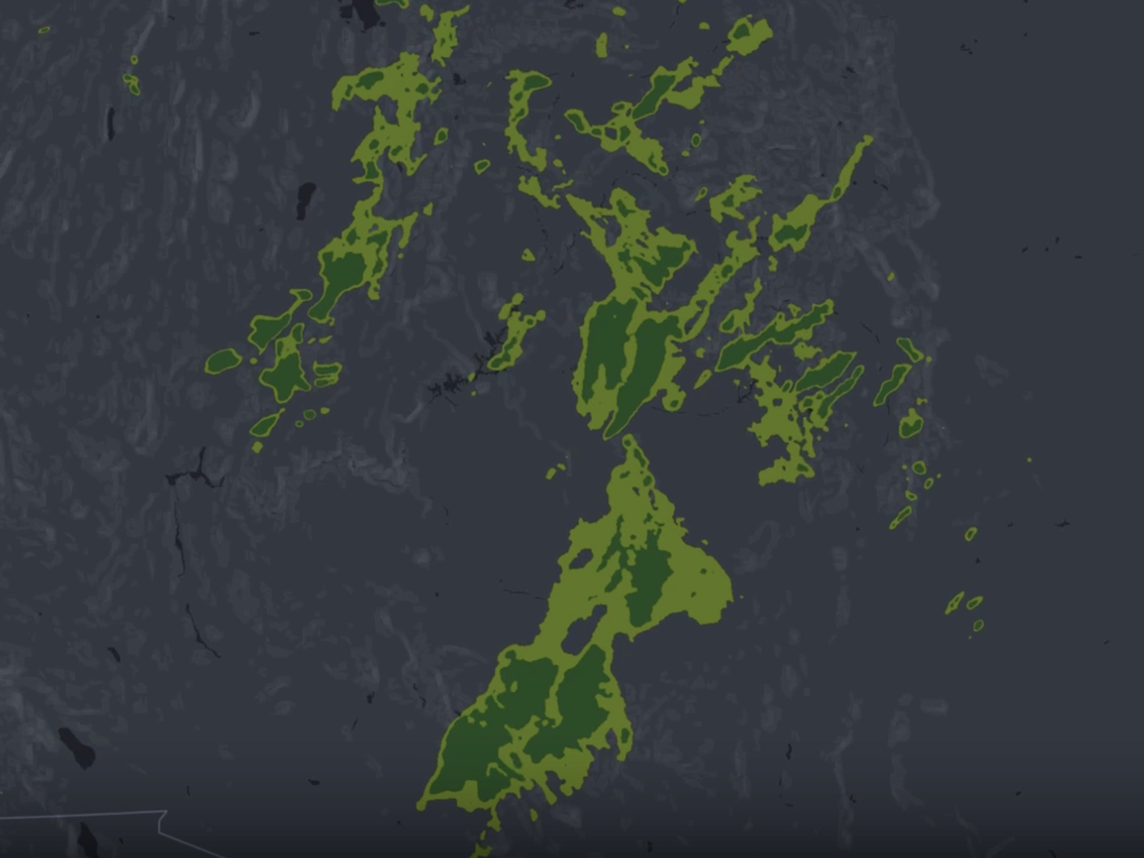
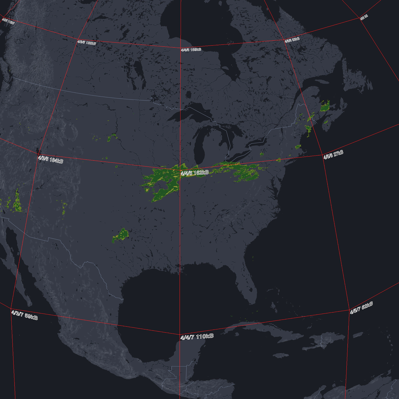
The limitations of this method become quite obvious, however, once we introduce yet another dimension into the picture - time. As long as we’re only interested in data for one given moment, and can spare the waiting time to switch to another one, it’s perhaps satisfactory. If the goal, however, is a fluid motion between timeframes, suddenly the problem becomes much harder. It’s very easy to try it out for yourself; fire up your weather app of choice, and see how many react well to timeline changes. Most will debounce the slider, avoiding even attempting to solve this. In all other cases, the data will be pre-rendered as a video feed and simply played over, start to finish, to produce motion, typically as a composite of all layers necessary.
We weren’t satisfied with any of this. We wanted full interactive behavior, instant reaction to time changes, smooth animations and control over each layer individually.

Reinventing the tile
✦
Data delivery
The first thing that needed to change was the data delivery. Waiting for dozens of request for every screen, every time wasn’t going to be practical, especially considering we serve more than one layer at a time. Trying to preload tiles quickly filled up the system memory while failing to produce satisfactory quality. The reason for that is very easy to understand; at maximum zoom we would want to support, say 13, there would be 2^13 x 2^13 = 2^46 tiles in total to download. However, the original, underlying dataset isn’t nearly as large. The size stems from the fact that at those zoom levels, the client, especially with a 4K screen, needs a lot of pixels to present a sharp representation of the underlying values, and the server generated a lot of filler on demand.
What we decided to do instead was to limit the entropy over the wire by sending the actual data points from the original source. This guaranteed that we preserved the ground truth information as long as possible, before it was presented on the screen. One such data snapshot was larger than equivalent tiles to cover just one screen, but since it had all the resolution needed for zoom levels, this amortizes very quickly during application use.
Projections
Another benefit and associated challenge lay in the map projections. We opted not to reproject the data to a common format. A lot of our software has a 3D globe view, that is able to perfectly represent all map projections. In tandem, manyof the projections used for the original data representation were carefully chosen to minimize distortion over a specific area, while keeping the resolution reasonable. All of the products that reproject data to Web Mercator must either lose accuracy or send much more data than needed to compensate for it.
Instead, we implemented the projection math directly on GPUs, in the shader language. This means we’re able to ingest data in commonly used projections, such as [Lambert Azimuthal Equal-Area](https://en.wikipedia.org/wiki/Lambert_azimuthal_equal-area_projection), and preserve them perfectly, doing direct mapping of individual data texels to the surface of a 3D sphere. In case of a flat map, we simply compute the Web Mercator required in that case.
Animation
With the data set size known in advance, we could budget our resources to preload and prepare all of the frames of data for all the layers we wanted to show. The frames reside in the GPU memory, limiting the memory pressure for the browser tab, and allow instant playback at frame rates of 60fps and above.Additionally, because the presentation was controlled entirely by frontend code, we were able to *interpolate* between multiple data frames, resulting in an organic, fluid result. This makes it much easier to observe trends in movement, helping predict the behavior of the weather patterns and visualizing the forecast trends as linear progressions rather than individual snapshots in time.
Before

aFTER
■
Advanced optimizations
Even though our method has been well tested in production already, receiving stellar feedback from the users, we didn’t stop there.
Firstly, we integrated more and more data sources. Even on modern GPUs, hours of past weather data can quickly fill up the entire memory. We used many methods, such as texture compression and supercompression(1), as well as virtual sparse textures to minimize the memory footprint while keeping the data availability high.
To reduce the network bandwidth even further, we experimented with cutting-edge compression algorithms such as AV1 and VP9. They required careful fine-tuning to strike a balance between size and quality, since the default settings are meant for completely different frame content. Additionally, we were able to leverage hardware decoding to minimize the memory pressure of the JS engine even further.
The Use of AI
In the current day and age, it’s almost expected that every sufficiently advanced body of work discloses generative AI use, both for credibility and for informational purposes. For the original research and algorithm implementation, using LLMs wasn’t particularly useful. Even though they could directly produce specific implementations when asked for them, they couldn’t find solutions on their own or propose optimizations or improvements. As such, they were mostly useful in refactoring and moving code around.
Even though there were a few preexisting related implementations (dealing with e.g. map projections), after evaluation they came with bugs or unacceptable limitations, and attempts at translating those solutions with LLM similarly wasn’t successful. In the end, the most crucial code was almost entirely designed, written, tested and profiled by hand.
Conclusions
We believe that our system outperforms most if not all map engines commercially available on the market today. The ability to quickly see weather at any point in time and to animate it to directly visualize trends can’t be overstated, and enables better decisions that have direct impact on fuel, time, and human lives.


.png)