At ASI we build software for critical industries like aviation, defense and energy. Operators in these spaces need to understand how potential issues can arise while there’s still time to respond. For example, an aircraft’s route that looks clear now could cross a dangerous storm hours later. Identifying such cases early provides optionality to take a safer, more efficient route.
Flyways, our aviation platform, enables this by pairing weather alerts and route recommendations with a map that lets operators simulate aircraft and weather over time. This simulation is key to decision making in a safety critical environment because it gives experts the context to understand the risks and trust the plan they’re about to execute.
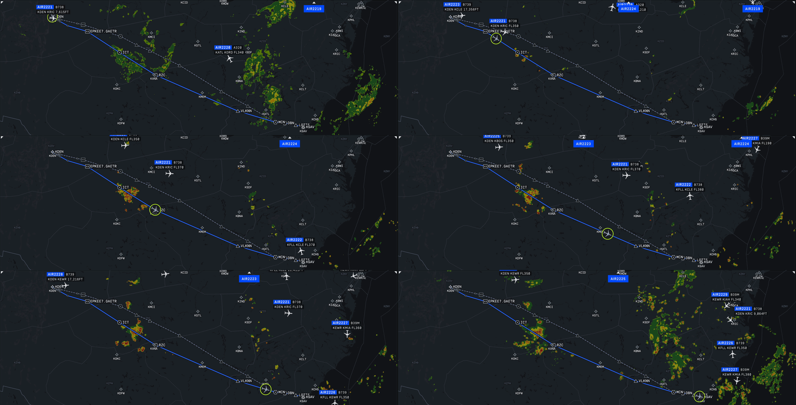
To display weather in this simulation, we work with data that often comes as rasters: grids of cells, similar to pixels in an image. Each cell represents a geographic area and stores a value, such as temperature or precipitation.
Our maps need to provide global coverage, display over a dozen data sources simultaneously, and let operators quickly explore rasters across different time and altitude slices. They also need to run on legacy hardware with limited processing power and bandwidth. The approaches we tried couldn’t deliver fast loading, smooth animation, and fine detail all at once.
To meet the high demands of these critical industries, we needed to shift away from the common approach and build our own system for delivering and rendering weather data.
Tiled rasters
The common approach is to render raster data on the server and deliver it as image tiles. Each tile is identified by three coordinates: x and y specify its column and row in a grid, and z specifies the zoom level. Level zero has a single tile. Each additional level divides every tile into four, giving four tiles at level one, sixteen at level two, etc. Tiles keep the same pixel dimensions, so higher zoom levels provide more pixels for a smaller geographic area.
These tiles typically use Web Mercator which is a map projection that translates locations on Earth’s curved surface onto a flat and rectangular map. The server delivers the tiles as RGBA images, which the client can overlay directly on a map.
This solution has several benefits:
Clients only have to deal with one format, and many mapping libraries support image tiles out of the box
Tiles can render as they arrive
Tiles stay sharp at higher zoom levels
The tiled rendering tools we started with were designed around displaying a single snapshot of time. Our use case required smooth animation across time. Each time step needs its own set of tiles, and waiting for them to load interrupts playback. Some apps handle this by updating only when the time slider stops but that makes it hard to follow changing conditions. Others combine layers into a pre-rendered video for smooth playback, but then users can’t toggle individual weather layers such as rain or wind.
We initially tried to adapt image tiles to our performance goals. The map showed a low-resolution preview first, replacing it as detailed tiles arrived. Compressing the tile images helped fit more data in graphics memory, but higher zoom levels still required too many tiles to preload. Detailed views therefore had to load on demand.
Rendering rasters over time
Data delivery
Waiting for tiles to download interrupts playback, and preloading them across time and zoom levels requires too much data. Each higher zoom level uses more pixels to show the same weather values, resulting in downloading and storing increasingly large renderings of the same data. Sending the source grid once avoids that duplication, so we switched to preloading raw weather data and generating the images on the client.
For our test dataset, we compared both approaches on nine hours of storm forecast data from CIWS and CoSPA [1]. Preloading image tiles required about 100 MiB upfront, and total downloads reached a few GiB over a day of use. Sending raw data reduced the initial download to 15 MiB for all zoom levels and cut total downloads throughout the shift down to around 0.8 GiB. The initial view of the raw data took about 1.4 s instead of 700 ms to load, but weather could be displayed with zero latency when the user panned or zoomed into any region.
This reduced the amount of data we needed to transfer and store, but it also moved the image processing to the client. The client now had to turn raw weather values into smooth, colored shapes, position them, and animate transitions between time snapshots.
Smoothing
Drawing each weather grid cell in a single color can make the map look blocky, especially when zoomed in. With image tiles, the server handled smoothing and coloring. We moved that work to the client using:
resampling – calculating the values for a displayed image using the original grid cells and interpolating between them
color banding – assigning colors to a range of values
supersampling – rendering data at a higher resolution and then downsampling to remove jagged edges
Our initial resampling implementation used nearest-neighbor sampling and bilinear interpolation. The results had sharp corners and uneven edges, especially in quantized datasets, where values were restricted to a few discrete levels such as whole numbers from 1 to 10.
Switching to bicubic interpolation based on Hermite curves gave us smoother boundaries while matching the source values at the original grid points [2, 3]. This helped keep small areas of intense weather visible.
Image tiles arrive with colors already assigned, but rendering raw data meant we had to do that client side. One critical step we took to accurate and smooth coloring was preserving fractional values until color assignment so that rounding wouldn’t shift the band boundaries. Rounding 0.4 °C to 0 °C, for example, would incorrectly include a warmer location in a band showing temperatures at or below freezing.
Different datasets also needed different color scales. A precipitation layer could use three bands for light, moderate, and heavy rain, while a temperature layer could use more bands to distinguish smaller changes. A data texture stored these scales as a lookup table for the GPU, letting the same renderer display either.
The final step was 16× supersampling, which combined colors from 16 sample positions per displayed pixel to reduce jagged edges.
Projections
Our applications use a globe to give operators accurate geographic information around the world. Keeping them on Earth’s curved surface avoids the stretching of areas and shapes that comes with flattening the entire planet onto a 2D map.
- Projection
- Scale
- Stretch
With Web Mercator tiling, source data is first rendered into flat image tiles, and then mapped onto a globe. This prevents stretching but requires another round of resampling which can result in data loss. Small weather features can become blurred or their boundaries can shift, and detail lost when generating the flat tiles cannot be restored.
Instead, we kept each dataset in its original projection and mapped it directly onto the globe, eliminating the intermediate Web Mercator raster.
This required supporting various projections used by our data providers. Providers choose projections based on their coverage and intended use. A regional dataset might minimize distortion across the continental United States. A dataset used to measure how much land is affected by heavy rain might use an equal-area projection so the map doesn’t exaggerate or shrink the affected area. Our renderer needed to account for these differences to position each dataset correctly.
Finding existing high quality implementations proved difficult, so we implemented the projection formulas ourselves. We also chose to run them in GPU shaders. This let the GPU calculate positions and sample weather values in parallel during rendering, with the added benefit of reducing CPU load.
Animations
Smooth animation helps operators follow changing weather and see when it could intersect a flight’s route. Pauses and jumps between snapshots make those interactions harder to track.
The key to smoothness was to blend corresponding weather values from adjacent time frames before resampling and color banding. This let color boundaries grow, shrink, and change shape between snapshots. Blending finished images would only fade one image into another.
Keeping playback fast required having the data ready on the GPU. Caching raw data made memory use predictable, so we could budget for the layers and time range we needed and preload their frames into GPU memory. Our shaders could then read the data without waiting for downloads or additional GPU uploads, supporting playback at 60 fps and above.
While our testers universally preferred smooth animations, we deliberately disabled it in several cases to ensure that our presentation is as truthful to the original as possible. An in-between state could have been considered as a new “forecast”, and in places where trusted data provenance matters, that was unacceptable. This was especially true around datasets used to check the safety of a flight path vs validate an optimization opportunity.
Conclusions & future research
Building our own raster renderer was overall a successful effort. We achieved detailed weather displays that animate smoothly across time and zoom levels while using a sixth of the bandwidth and less RAM and GPU memory. It’s been adopted into all our products and is a core capability for many users.
Making this work across many datasets took more engineering work than covered here. We tuned video compression techniques to save bandwidth and built our own sparse virtual texturing system to transfer smaller chunks of data from RAM to GPU. We also had to figure out how to handle weather forecast updates without interrupting existing views. The choices behind compression, memory management, and continuous updates each deserve a closer look that we’ll maybe save for a future post.
Further savings could come from changing how we represent weather. A grid stores values cell by cell, even across broad regions where conditions vary little. Describing those patterns more compactly could reduce downloads and memory use, making room for more layers or longer animations. Promising directions include Gaussian splatting for representing weather fields and B-spline curves or signed distance fields for encoding band boundaries. These approaches could describe the weather’s shapes with less data, but we still need to test how well they preserve forecast values and handle changing conditions over time.
Appendix
[1] CIWS and CoSPA – High resolution storm forecasts in the 0–2 hour, and 2–8 hour ranges. CIWS Reference, CoSPA Reference
[2] Bicubic interpolation — two-dimensional mathematical method used to find unknown intermediate values in a grid by looking at the 16 nearest known data points. Reference
[3] Hermite curves — a smooth curve segment defined by its two endpoints and the tangent (slope) vectors at those endpoints. Reference
Credits
Engineering: Bartek Banachewicz
Visual Design: Saif Haobsh & Xander Smith
Editing: Sahas Dendukuri